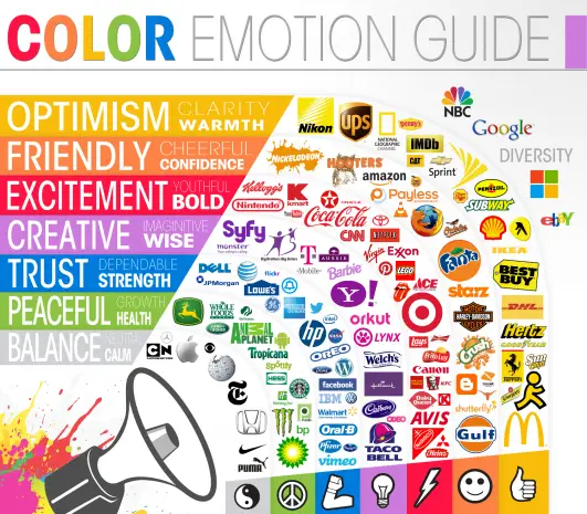
'Why is Facebook blue?' is, to me, an over-asked question in the web design community.
Blue is meant to be a strong, honest and trustworthy color - so trustworthy that people don't think twice about sharing their personal data with a network that employs this color scheme I guess!
What do colors mean in web design?
While it's true that color theory and the psychology and emotions that people associate with colors is fascinating and highly relevant, I'd also ask you to look at this well-known graphic and tell me whether any of the brands pictured below trigger the emotions in you that this color guide says they do.

My theory is that color can play a part, but overall marketing, branding, PR, and advertising will drown any psychological color voodoo out.